")

Do you feel like your marketing campaigns aren’t performing as well as you wanted? Have you been stuck wondering how to generate leads for website development? While there are a lot of different tools and tactics that you can use when developing the perfect digital marketing strategy, one of the most critical factors that you need to consider is color theory. The way that we as a society see and feel about colors has a much more significant impact on our buying habits and decisions than you might think. In fact, it even changes how we develop our digital marketing solutions in Cleveland.
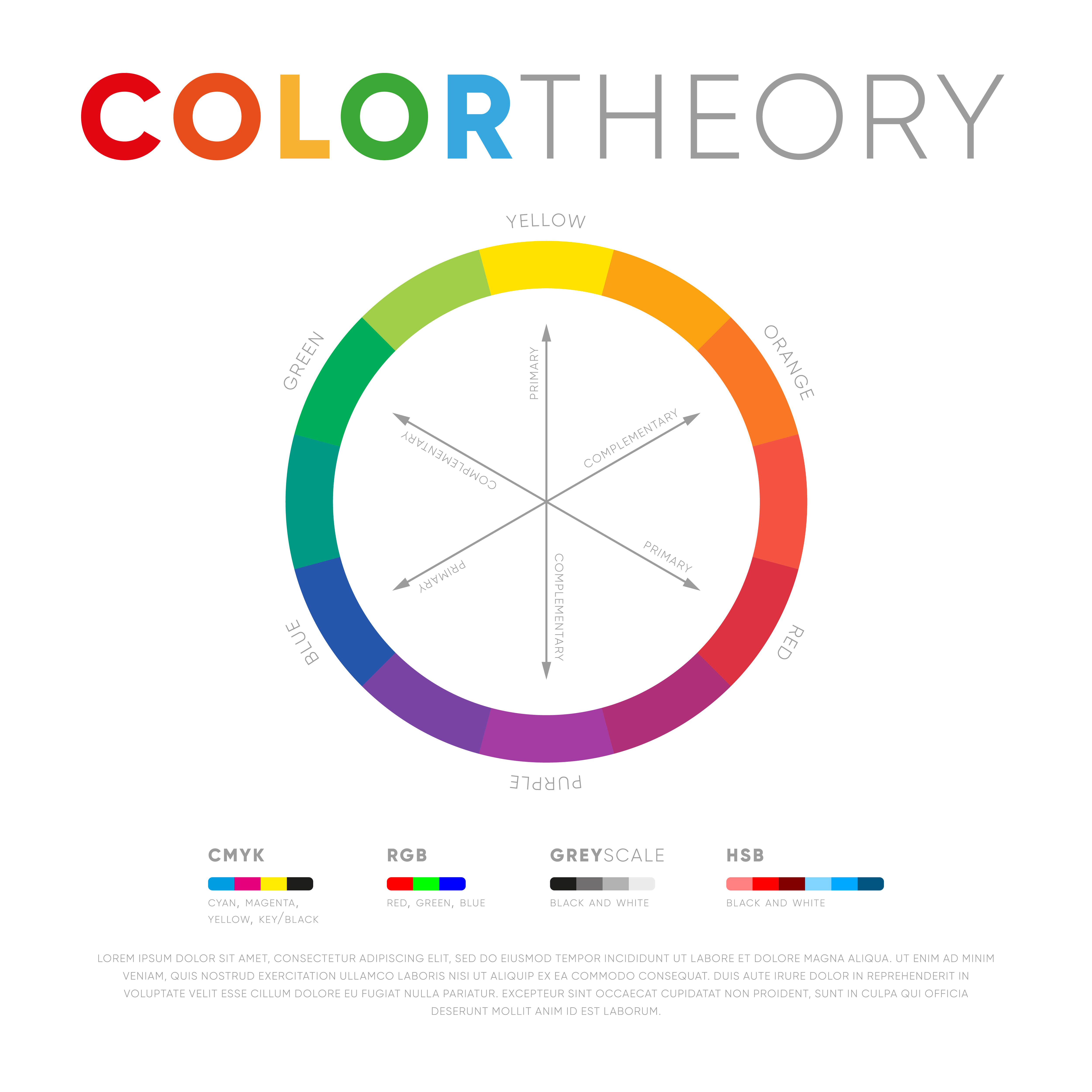
What Is Color Theory?
Color theory is the study of color psychology. It defines how colors combine, how we are likely to react to them, and the type of feeling or message they usually convey. Color theory is built upon three basic elements: color context, color harmonies, and the color wheel. The standard color wheel is based on the 12 colors that are found in the visible spectrum. It’s an essential tool for creating color combinations or mixing colors. Color harmony is the process of matching colors to create a color scheme. Using the color wheel provides a basic set of rules to help determine which colors pair well together and which colors will clash. Color context essentially refers to whether or not our general response to a specific color changes depending on the context we see it in, and if it does, by how much does it change?
Different Colors = Different Reactions
People typically decide whether or not they like a product or design that they see in 90 seconds or less. On top of that, 90% of that decision is based solely on the color or colors used. So, a crucial part of your branding has to focus on color if you want to increase your website development leads.
While different colors produce different responses based on the person, many colors get similar responses from a majority of people. Due to these common emotions and responses, marketing companies have to focus on color psychology heavily when creating their marketing strategies and designs, regardless of what industry they are a part of. Below, we’ve broken down each color and the typical responses and emotions associated with them.
Red- This color is bold and exciting and has been shown as one of the colors that increases appetite, which is why many food brands utilize red in their logo. Red can also be used to signify danger.
Orange- This color is bright, fun, and cheerful. Since orange is a mix of red and yellow, it has a lot of the same traits. For example, orange is also known to stimulate your appetite.
Yellow- The color of sunshine is all about happiness, warmth, and optimism. Out of every color, this one draws your eye the most because of how bright it is, so it is often used in eye-catching designs to encourage impulse purchases.
Green- This color is the most often associated with wellness, peace, and freshness. When you see green, it has a calm and clean effect, which is why it can be used in fresh food campaigns as well as business logos. Green is also the staple color of environmentally friendly campaigns.
Blue- This color evokes trust and dependability. In general, most men prefer the color blue, and so it is very often used in male-centric marketing campaigns.
Purple- Purple signifies creativity and imagination. Purple is also more traditionally associated with royalty, which is why purple is very often used with luxury brands.
Pink- Pink evokes compassion and romance. It is often associated with femininity, which is why it’s used so often in female-centric marketing campaigns.
Black- When it comes to prestige and sophistication, black is the color most often thought of. This is why along with purple, black is very often used by luxury and high-priced brands.
Grey- This color is as neutral as you can get, which is why it is most commonly used to convey balance and calm.
White- White is usually associated with innocence, purity, and perfection. It evokes a clean or crisp feel.
Is Color Theory That Important?
When appropriately used, the color of a product or design can make consumers believe that it tastes better and fresher than the same product that’s in a different color. Similarly, it has also been shown to make medicines look and feel more effective to the user.
For example, have you ever noticed that call-to-action buttons are typically filled in red on top of a plain background? This is because marketing research suggests that red performs the best at getting someone’s attention. It pushes urgency onto the consumers to act. In fact, studies have revealed that a red CTA button performs 21% better on average than a green counterpart.
As long as you are following the correct information and choosing the right color combinations, utilizing color theory is proven to substantially improve website development leads. It can easily become the most important thing you decide when creating your digital marketing campaigns.
Shift Refresh is a Cleveland lead generation agency that enables businesses to smash their competition and emerge as a leader in their respective industries with the help of our digital marketing solutions in Cleveland, Ohio. We are ready to help your business not only grow but thrive.
To learn more, call us at 1-888-467-3249 or visit our website.


0 Comments